The Antwerp jesuit church, a revelation.
The façade
Attention! Attention! Have you seen me?
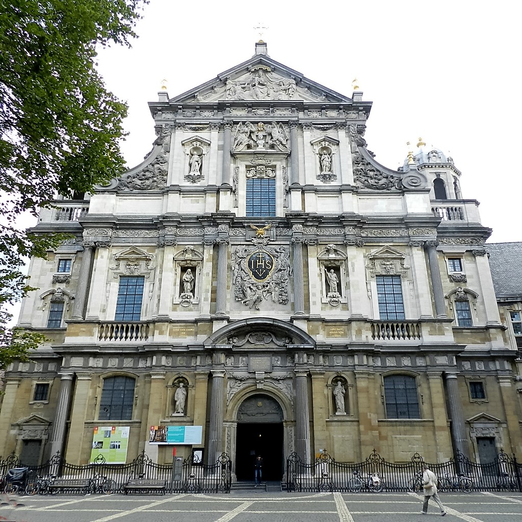
For a Baroque building the façade is extremely important. It must draw the attention of the passers-by. Rome may be famous for its innumerable Baroque façades, here the effect is stronger and more superb because all possible means have been used, such as the immense dimensions, the dynamic design, the variety in building materials and the lush decoration.
Those who go and have a look behind the screens of this façade, from Grote Goddaert or Minderbroedersrui, will quickly see through the secret of the façade that has been thrown up: the front is no less than 8 m (or 26 ¼ ft.) taller than the ridge of the roof.
It is good to bear in mind where exactly the big window of the central naveThe space between the two central series of pillars of the nave. is situated in the whole of the front: above it there is the bust of Ignatius and on top of that the fronton. Once you are inside the church, you may become aware of what a gigantic screen this façade is, since it is still 8 m (or 26 ¼ ft.) taller than the big window above the organ. Moreover, to the visible width of the interior the two stair towers should be added!

Initially the dimensions were wonderfully equal in height (without the cross) and in width: 33.2 m (or 109 ft.) so that the façade is inscribed in a perfect square. One cannot think of a better balance, but 4 of the 7 steps have disappeared under the levelled-up square.
The vertical movement is first of all the result of the way the façade has been composed: starting from the cross on top in the middle, the movement softly flows over the slanting sides of the fronton to hasten downwards along the immense volutes and ultimately fall down along the freestanding Ionic columns on the extreme corners of the tall aisles. To this common vertical movement an upward one is added. Both stair towers, which are crowned with an arbour on top, receive the vertical movement from the volutes and lift it once again to make it land on the ground floor. To lift the front from the ground level there is a plinth along it, which is interrupted by stairs consisting of seven steps for each of the three gates. From an aesthetic point of view this base was a starting point of vertical elegance. Now the major part of the plinth is hidden beneath the pavement of the levelled-up square, so that only three steps are still to be seen.
- In the façade, this upward movement is accentuated by the identical positioning of columns and pilasters at all sections: freestanding columns in the middle, the pilasters at the sides and – except for the second section – once again freestanding columns at the extreme corners. Especially the columns that have been put one above the other in the centre, cause a strong upward effect. Also, the identical positioning of the niches with statues in each section of the third and fifth bayThe space between two supports (wall or pillars) in the longitudinal direction of the nave, transept, choir, or aisle. contribute to this.
- A subtler element of verticality is the so-called classical order of columns and pilasters, in:
- the 1st section: A subtler element of verticality is the so-called classical order of columns and pilasters, in:
- the 2nd section: the more elegant Ionic style with volutes
- the 3de section: the even more decoratively elaborated Corinthian style.
- Finally gilded decorative elements accentuate the verticality of the whole façade. Braziers and candelabras on the upper and lower extremes of the volutes respectively flank the gilded cross on top, while the arbour of each stair tower is crowned with a big gilded pineapple.
The horizontal dimension is first of all caused by the more or less equal height of the sections.
- Clear horizontal dividing lines between the different sections are the strongly profiled cornices. In the second and third sections, these are accentuated by the continuous alternation of pedestals, mirrors and balustrades. In the 1st section there is a plinth, which used to be higher.
- There is always a frieze to enliven these lines:
- between 1st – 2nd section: a fascia with alternating metopes and triglyphs
- 2nd – 3rd section: a fascia with stylized botanical motifs
- 3rd section – fronton: a fascia with nine flat cartouches.
This is provided by the gigantic volutes, the classical order of columns and pilasters, the partly protruding cornice underneath the 2nd section and the ditto round-arched tympanum, as well as by the slightly backward positioning of the stair towers and their crowning with an arbour.
The warm feeling the façade exhales is mostly due to the cream-coloured sandstone of the load-bearing stones and most sculptural motifs. Contrary to the monotone Baroque façades in Rome, this one is full of contrast because of the grey freestone, used for constructive, more delineating elements such as columns and pilasters, cornices, architraves and volutes, plinth and steps.

The strongly profiled architectonic morphology of the Baroque as such already contributes to the decoration:
- columns and pilasters, balusters and cartouches
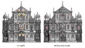
- Specific decorative elements are shells, festoons, cornucopias, baskets of fruit and masks.
- Statues of saints and angels also cause relief.
- The façade is playfully crowned with gilded objects such as braziers and candelabras on the volutes, which flank the cross on top of the central naveThe rear part of the church which is reserved for the congregation. The nave extends to the transept., or the big pineapples on the arbours of the stair towers. Also, the inscriptions on the façade have been gilded. The one on the central black coat of arms is the most striking one.
When you compare this front with the stately Renaissance façade of the Antwerp Town Hall the most striking elements of the Baroque are: the focus on the façade, the dynamic design with a stronger vertical power and the omnipresent decoration. The social function is identical for both buildings: to catch the eye, to impress, to express prestige and identity. The splendour and the exuberant decoration of the church building no doubt reflect the enormous self-awareness of the Catholic Church in the Counter Reformation.


